Music Video

Digipak Net

Digipak Net

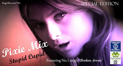
Digipak Front Cover

Digipak Front Cover

Digipak inside left panel

Digipak inside left panel

Digipak inside right panel

Digipak inside right panel

Digipak Back Cover

Digipak Back Cover

Magazine Advert

Magazine Advert

Sunday, 27 February 2011

Audience Feedback On Digipack...


I needed to gain some sort of audience feedback on my CD Digipack so I decided to upload all four panels onto my Facebook page so some of my friends could comment with their opinion on it. I created an album and named it 'MEDIA' with the following caption...
Basically, for our music video for media we needed to create a digipack for the album, and I really need some audience feedback on it..
- What do you like about it ?
- Does it fit in with the pop genre?
- Any improvements etc
Really appreciate ...any feedback Thanks :)


Front cover Feedback...


Inside Left Feedback...

Inside Right Feedback...


Back Cover Feedback...


Thursday, 10 February 2011

Digipack Net...


Individual Digipack Covers...

FRONT COVER:


INSIDE LEFT:


INSIDE RIGHT:


BACK COVER:


Wednesday, 9 February 2011

Digipack process...

Creating the front cover...

I decided to use the close up shot of Elle singing in the studio as the front cover for my digipack and experimented by adding effects and techniques on Photoshop...

Idea 1...


  • Added the name of the artist as this is usually positioned first on digipacks followed by the name of the album.
  • Used a girly font that would fit with the conventions of the pop genre and used white so it stands out and appears prominent.

Idea 2...


  • Applied lighting in an effect called 'coral painter' and chose three colours that I wanted to use. I chose red, pink and lilac as they ae feminine colours and conform to the conventions of the pop genre.
  • Changed the font as I felt the initial one did not match the effects of the image so I chose one that I thought looked more professional.
  • The band name is also in capitals and slightly bigger than the album name as this is how it appears on most pop albums.

Discarded Covers...

Idea 3...

  • From this step, I decided to experiment with the lighting and make it look slightly lighter and the outcome looked quite professional.
  • But from this, the image lost it's quality and looked blurry and not sharp so I decided to stick with the previous one and discarded this one.

Idea 4...


  • Experimented with a different affect and posterised the shot and added the colour pink as it is a feminine colour.
  • Changed the font colour from white to black as white did not stand out against the background.
  • However, I gained some audience feedback and everyone preffered 'Idea 2' which was also my favourite so I decided to choose that one.


Further Adjustments...
I was very happy with Idea 2 but I still felt as though it looked rather plain and had some things missing. So, I did some more research into pop album covers and added some more elements...

  • I added some logos/stickers to make it look more realistic
  • Added the name of the record label in small print so it was not so noticeable
  • Changed the font as I thought this one fitted with the rest of the handwritten style fonts I had
  • Decided to put the song 'Broken Arrow' to add more recognition

    Creating the back cover...

  • I used the shot of Elle's eyes open and cropped it so only just one eye was in the shot as I thought this would look more dramatic and effective.

  • I then adjusted the brightness and contrast so the shot appeared a lot lighter which I thought would make it look more professional.
  • I enhanced her eye make up and darkened her eyes, mascara and eyebrows slightly so that it appeared more dramatic.
  • I then typed up the track list in a girly handwritten style font and used black to bring out the darkness of her eyes and to stand out against the light background.

    I then added the barcode to make it look more realistic like it would be on the shelf in a shop ready to be purchased.


    Creating the inside panels...

  • For the inside right panel I used a shot of Elle laying on the floor and adjusted the brightness and contrast so it did not appear in black and white like in the video.
  • I used autoshapes and added the round shape of the CD with smaller circles in the centre with the album and band name. I used black as it would stand out against the lighter background.

For the left inside panel, I decided not to use any form of image from the music video but add an element of personalisation. I decided to use the form of a letter from the artist to the fans which I have previously seen in other pop album digipacks. I used a plain white background and black writing and a handwriting style font to make it appear like a real letter.


I also included a lip-stick kiss as it makes it look girly and conforms to the conventions of the pop genre.

Album cover ideas....


For my digipack design, I am thinking of choosing a screen shot of Elle in our music video as the front cover. From my research, I found out that many pop album covers contain the female artist on the front cover so I decided to conform to this idea.


Below are a few performance shots that I am thinking of using for either of my panels in my digipack:
Elle in the studio: Close up/ canted angle of Elle singing, she takes up most of the framing so that it is evident to the purchaser whose album it is. She is also looking directly at the audience ( the gaze) to connect and engage with her fans.


Elle laying on the floor: High angle/ mid shot of Elle singing shows vulnerability, also takes up most of the framing, also the idea of her creating a triangular shape with her arm adds interest to the shot and adds to the composition. She looks upset which relates to the theme of the album consisting of sad love songs.


Extreme close up of Elle's eyes: These shots are of her eyes closed and shut, they reflect the sorrow in her eyes which reflect back to the theme of the sad love songs on the album.

I will experiment with these shots on Abode Photoshop and add effects to create my digipack. I will later on blog about the process of creating the digipack and experimenting with different techniques and effects.

Saturday, 5 February 2011

Voyeurism...

After realising that we need an element of Voyeurism in our music video of the artist, I decided to undertake some research into how artists reflect Voyeurism in their videos.

Tinie Tempah Feat. Kelly Rowland-Invincible...


In this video, the two artists are reflected onto illuminated buildings singing and this is filmed from a low angle shot to show their power and importance as an artist.

Black Eyed Peas-The Time...


In this music video, the artists are a group of mixed genders and all use the same form of Voyeurism. They use the still body of an artist and a different artists face and reflect it in a 3D box which is illuminated.

When we were experimenting with the new editing software 'Final Cut Pro' we found an effect we could use for our element of Voyeurism which is a television and we can insert a video within the tv to show a moving image. We really liked this idea and thought it fitted with our music video as it could be a point of view shot of the artist watching television but really her mind is occupied with the break up of her relationship so she is seeing this in the television.

Second Draft....

Yesterday in our media lesson we edited our music video further inserting more performance clips and making changes which we thought would better the music video.


  • We inserted some more performance shots of Elle singing for example a canted angle of her sitting on a large rock to show a variety of different shots
  • We changed the stop motion scene of cupid and the broken arrow and overlapped a close up of Elle and Alex lying down by using 'picture in picture' to show how the stop motion animation reflects their relationship
  • Also, to add to the narrative of the music video, the scenes on the park bench and in ikea we reversed them so it is happening backwards to show how their relationship is broken as they are no longer together. I particularly liked this idea and change as it related to the narrative and lyrics of the song and enhanced the meaning to the audience through the editing techniques.

Thursday, 3 February 2011

Track List...?

Me and Emma found a website and were truely amazed by it and thought that by using the last 4 words of the quotations was really creative and creates a unique album name. Here are a few examples we found from other quotes.

These quote may also be our track list if we like them enough and they fit with the conventions of the pop genre.

The act of repeating erroneously the words of another.
Ambrose Bierce -The Devil's Dictionary

Write a wise saying and your name will live forever.

A facility for quotation covers the absence of original thought.
Dorothy L. Sayers , Lord Peter Wimsey in "Gaudy Night"

Life itself is a quotation. things can fall together.
Marilyn Monroe

If a relationship is to evolve, it must go through a series of endings.
Lisa Moriyama

If you live to be a hundred, I want to live to be a hundred minus one day so I never have to live without you.
A. A. Milne

Love is the only sane and satisfactory answer to the problem of human existence.
Eric Fromm

When love is not madness, it is not love.
Pedro Calderon de la Barca

Men are born to succeed, not fail.
Henry David Thoreau

The great thing in this world is not so much where you stand, as in what direction you are moving.
Oliver Wendell Holmes (1809 - 1894)

Treat your friends as you do your pictures, and place them in their best light.
Jennie Jerome Churchill (1854 - 1921)

Tomas did not realize at the time that metaphors are dangerous. Metaphors are not to be trifled with. A single metaphor can give birth to love.
Milan Kundera (1929 - ), The Unbearable Lightness of Being

One good turn deserves another.
Gaius Petronius (~66 AD), (Petronius Arbiter), Satyricon

In a country as big as the United States, you can find fifty examples of anything.
Jeffery F. Chamberlain

Album names...

This evening, myself and Emma had a big in depth discussion on our album name and track list. Seen as our music video song is called 'Broken Arrow' we decided to use the theme of sad and depressed love songs as an influence for our album name.


First Idea....We liked the idea of cupid as a symbol of love and the connotations of the word 'cupid' has hidden meanings of arrows, and as we will use sad love songs as our theme we came up with the creative idea of 'Stupid Cupid'. The word 'stupid' pre modifies cupid (the symbol of love) and he is described as being stupid as the love songs are sad and upsetting and our female protagonist is now against love. We also thought this was extremely catchy as it ryhmes and thought it was very creative.


Second Idea...As our theme is sad and upsetting love songs we decided to incorporate the weather into this idea. Stereotypically, sunny hot weather is associated with happy love relationships and rain is associated with sad and upsetting times in a relationship. So we decided to use the word 'rain' as it has the connotations of the setting and mood being sad, grim and upsetting. We then decided to incorporate a colour into this and used the traditional colour of 'Red' as this has the connotations of love and passion as our songs are love songs but also anger as our female protagonist is angry in now angry in love. We combined the two and created 'Red Rain', we thought this was also very catchy due to the monosyllabic words it makes it short and sharp. The alliteration also makes it appear very creative.


We used google for some extra inspiration and found this website, http://www.buzzfeed.com/peggy/wikipedia-names-your-band, where it creatively generates a band name, an album name and an album cover. Obviously it's a bit random, but will come out different every time so if you didn't like it you could just start over.

From my 'Random' search, I got:

Strambino - As the Band Name. This was found by going onto the website Wikipedia and clicking the link 'Random Article'. This gave me this page about a place in Italy.

One Worth Listening To - Album Name. I quite like this for an album name as it's creative yet obvious at the same time. I found this by going onto
http://www.quotationspage.com/random.php3 and taking the last 4 words from the last quoteon the page at the time.

Wordle: Album names
The quote was: Anger is a signal, and one worth listening to.
Harriet Lerner, The Dance of Anger, 1985

I thought that this was clever as 'One Worth Listening To' could relate to a Album Name.


From this discussion between myself and Emma, we will share our ideas with Sophie and Elle and as a group come to a decision on which one to choose...

Extra filming...Day 5...

Yesterday, I was unable to attend my media lesson as I had a post applicant open day at Queen Mary's university. Emma was also unable to attend this lesson as she had her driving test so Elle and Sophie were the only ones in our group who were in the lesson.

During this time, they realised needed a variety of close ups and different shots to make our video's performance more choppy and professional, changing different clips and locations in time with the beat.

So they went out to film with the camera and uploaded and edited some footage:

Tuesday, 1 February 2011

Editing

We are now fully into editing our music video and using our storyboard as a guidance when choosing which shots to use and in which order. Over the past couple of weeks, we have been uploading and editing and only producing a small quantity of final footage as we were finding it quite difficult to organise the timing to make it extremely precise.


Recently, Elle and Sophie went to do some more editing in their free periods and produced the below :


We showed this to our teacher and she gave us some feedback:

- We need a better variety of shots so we have every single type of shot and not so many close ups.
- To use a bit more colour so that the mise en scene is different at times or use 'colour match' on Final cut pro so we can highlight certain objects in colour and still keep that black and white professional look
- Add more narrative shots of Elle and her boyfriend to balance out narrative shots and performance shots