Music Video

Digipak Net

Digipak Net

Digipak Front Cover

Digipak Front Cover

Digipak inside left panel

Digipak inside left panel

Digipak inside right panel

Digipak inside right panel

Digipak Back Cover

Digipak Back Cover

Magazine Advert

Magazine Advert

Thursday, 28 April 2011

Question 1) In what ways does your media product use, develop or challenge forms and conventions of real media products..?

Before filming our music video, we needed to undertake a lot of research to gain influence and ideas to include in our own music video. We went about doing this by watching and analysing recent pop music videos and romantic comedy movies and gaining influence from them.

(500) Days of Summer


This scene was filmed in IKEA and consists of the couple entering different rooms and pretending that it is their own home and they are living together. We mimicked this idea and used Intertextuality as we used an idea from another source of media. We went to IKEA and filmed the couple in a kitchen pretending to be in their own home.


In (500 Days of Summer) the female, Summer says 'the sink's broken' to the male actor, we reciprocated this scene as Elle also turns to say to Alex 'the sink's broken' whilst twisting the taps. As the song plays over the scenes, Elle mimes 'the sink's broken' which has an effect on our audience. If they have previously watched the film and are now watching our music video, they will hopefully realise the similarity, creating a link between the two media products.


Another scene where we used intertextuality was the editing technique of a split screen. In the 500 Days of Summer scene, the split screen conveys the idea of Expectation Vs Reality. We also conveyed this idea as we similarly used a split screen of what Elle wishes was happening and what was actually happening, again Expectation Vs Reality. We reinforced this idea by altering the lighting of the shots, the Expectation scene on the right has high key lighting to represent the happy mood and the Reality scene has low key lighting to represent how she is feeling lonely and isolated.


I had purely watched the film beforehand purely for entertainment reasons, but when we needed to think of ideas for our pop music video, we all realised that this film had many scenes that conformed to the conventions of a pop music video, which is why we were highly influenced by it.

Kate Nash- Foundations

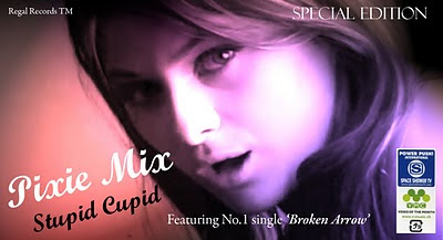
We then began to research into techniques used in pop music videos and were influenced by the song Foundations by Kate Nash. We used the idea of the stop motion of the socks in Foundations and thought of our own unique way of incorporating a stop motion into our music video but ensuring that it is relevant to our narrative. In Foundations, the socks move together when the couple are together and the socks move apart when they have had a break up. We then developed this idea by incorporating our own stop motion of cupid shooting an arrow through a heart and then the arrow falling and breaking. We developed this idea further by overlapping a scene from our footage behind the stop motion; we included a scene of Alex breaking a pencil near Elle's ear which symbolises the breaking of the arrow and the break up of their relationship. We decided to use cupid, the symbol of love as our narrative depicts the break up of a love story and the semantic field of cupid and love reflects the theme of the narrative. As the arrow falls and breaks it becomes a 'broken arrow' which reflects our song title and shows an evident link between moving image and the lyrics.

JoJo- Too little too late


We used the idea of the female protagonist reflecting on the memories her and her boyfriend shared together and developed it. Instead of including just one picture, we included several pictures and used a pan shot when filming. We also focused on the park scene picture and then used a transition which zoomed into the picture and then blended into the moving image scene. We then challenged this idea as we had the whole video including the picture scenes in black and white whereas the picture scene in JoJo's music video is in colour. The black and white idea also reniforces the idea of them being memories .
We overall challenged the majority of pop music videos as most are in strictly colour and only consist of performance shots, whereas we challenged the majority of pop music videos as ours was not in colour but strictly black and white and consisted of both narrative and performance shots. For example...


Alexis Jordan- Good girl


This video consists of strictly performance shots and is in colour throughout so our music video challenges this video which is what the majority of pop music videos are like.


Ikea from mood on Vimeo.

Question 2) How effective is the combination of your main product and ancillary tasks..?

Script for video:

For our music video we wanted to convey an overall sad and soppy feeling to the audience as the couple have split up. As the female protagonist is looking back at the old times when they were together we wanted to make the audience feel as though they are the female artist in the song. We achieved this by including different camera angles for example, canted angles to show her confused state of mind and choosing a narrative and locations that most teenagers are familiar with. We researched into other pop music videos to ensure that we had the conventions in terms of the mise en scene. We included a traditional love novel and a few kissing scenes.

At first, the performance shots were quite long as we had the same shot for about 3 lines worth of lyrics, and from some audience feedback, we decided to make the editing choppier. So, we went out and filmed more performance shots so that we had more footage to edit with and the video doesnt appear repetitive, but more fragmented by including one shot per line which made it more appealing to our audience.

My digi pak design and magazine advertisement were my ancillary tasks and I ensured that there was an evident link between all 3 products. I decided to use a shot from our music video for the front cover of my digi pak. For the inside right panel I also used a shot from our video and the back cover was a shot that I cropped. For the inside left panel, I did not use a shot from our music video and from research I undertook I found that pop albums have letters to fans inside so I decided to include this idea.

My digi pak linked with my magazine advert as I used the same picture from the front cover of my digipak and just simply changed the text around however, I still kept the colour and font the same to show synergy. From researching into other pop album adverts I was aware of the conventions of a magazine advert and realised that using the front cover of the digipak for the magazine advert was a common technique so I did the same. It also shows synergy between the two ancillary tasks so that an audience are aware of the link between the two products.

Below is a voice over and a slideshow of print screens from our music video discussing our choices..

Question 3) What have you learned from your audience feedback..?

Audience feedback for our music video and CD Digipak is essential because we gained audience feedback from our target audience. Our colleagues are teenage girls which is our target group so when we had their feedback, it was effective because it was from our target audience. When we had our feedback, we were able to take it into account and make the according changes.

Music Video Feedback:

We had a screening at our school where our 6th form and teachers had an opportunity to watch our music videos. We took this opportunity to gain some feedback from them, which was as follows...


We printed off yellow feedback sheets with questions about our music video, which the audience answered and we read and took into account. The overall feedback was that they thought the narrative was cute, and they liked the photographs, and the idea of the whole music video being in black and white.


Deleted Scenes:
We initially had many reverse clips as we had all the previous shots repeated, but just in reverse mode to portray the undoing of their relationship and the female is going back to where they met and wishes to change time so that they never met. However, from some feedback of our peers and teachers we were told that there were too many reverse clips making our music video appear very cliche'd and too predictable. However, we all liked our idea of the reverse clips but realised that we needed to delete some as our peers were our target audience and seen as they did not like it, it was highly likely that others would not like it either. As a result, we only had the one park scene in reverse to introduce the concept, but then replaced the other reverse shots with performance shots.


At the beginning of our music video, we also had this shot, just to reinforce the concept of studio performance shots. Elle is not singing but just simply preparing herself for the filming and we wanted it to appear as a 'behind the scene' type of shot. However, our target audience felt that this shot was a bit inappropriate and also not very relevant, so we decided to delete it.


Digi pak feedback:

In order to gain audience feedback on my CD Digipack I decided to upload all four panels onto my Facebook page so some of my friends could comment with their opinion on it. I created an album and named it 'MEDIA' with the following caption...
Basically, for our music video for media we needed to create a digipack for the album, and I really need some audience feedback on it..
- What do you like about it ?
- Does it fit in with the pop genre?
- Any improvements etc
Really appreciate ...any feedback Thanks :)

The feedback given was as follows:

Question 4) How did you use media technologies in the construction and research, planning and evaluation stages..?

Media Evaluation Question 4

Sunday, 17 April 2011

Audience Feedback On Music Video...

On Thursday 7th April, the day after our deadline, ourselves and our teachers hosted a Media screening after school. This consisted of showing our 6th form, teachers and any others who wanted to come our music video productions. It was a great opportunity to show off to our friends and colleagues what we have been working on for the past year and it also gave them an insight into the Media course. We benefitted from this screening as we gained a lot of audience feedback on our music video from the audience who wrote their comments and opinions on sheets we gave them before hand...


What you like: Very good, like the way they show the girl and boy together and then just her

Favourite part: All of it !


What you like: The lipsynching and the use of black and white


Favourite part: The telescope shot at the beginning


What you like: Good use of the photographs, the singing seemed very real, and good camera angles


What you like: Very cute, the zooming into pictures was good, and good choice of black and white


What you like: I like the scenes when she's with her boyfriend, very good


Favourite part: The end part


What you like: Going into photograph and the park bench reading scene.


Favourite part: Black and white like the memories, like an old film.


Wednesday, 30 March 2011

Sixth Draft...


In this draft, we only made minor changes and perfected some shots seen as our deadline and screening is nearing...We changed the overlapping shot of the stop motion from a scene with the couple smiling to a scene of them on the bed where Alex is annoying Elle. This supports the idea of the stop motion better as it is of a broken arrow, and their relationship is now broken. Personally, I preferred the juxtaposition of the two shots, but this might confuse a teenage audience so we changed it.

Fifth Draft...


There is so much that we changed in this draft, especially at the beginning of the music video. At the beginning, we scraped the L.O.V.E. letters moving and replaced it with a sort of establishing shot that we filmed at Alexandra Palace. It's a shot of Elle running up to the telescope and looking through it, which reflects how she is looking back into her previous relationship, which the music video depicts.

We also incorporated our script which we needed, and as we all have different album names we had to settle with just one for the credits, so embarked on some research...

LP - Long Play

EP - Extended Play

Extended play lies in between a full album and a single. So the CD in the shop would have our music single, broken arrow and plus maybe two or three more. So we changed the opening credits to 'Broken Arrow EP' to mean the single and it will avoid any confusion with album covers. We also included our production name "SEEN producitons" from year 12 as it was easier and it fits with our group.

We also replaced a few clips; we used a clip of Elle singing at Alexandra Palace and another Ikea shot. We chose the ALexandra Palace clip because the shot uses the rule of thirds and to the right of her you can see a lot of sky line and all the lights from the city of London. The Ikea shot was also changed and we used a scene from another kitchen, we just simply liked this kitchen better and it was also less shaky than the previous one.

Fourth Draft...


We changed our film from black and white back to the original colour when we filmed it. The colour mise en scene fits in with the pop genre as the colours are quite vibrant, but as we filmed over a few months, Elle changed her hair colour from brunette to blonde. This change is evident in the scenes as we have shots of her with both hair colours, and leaving the music video in colour does not show continuity and would confuse an audience. So, we have decided just to keep it in black and white as it also appears more professional.

Saturday, 26 March 2011

Third Draft...


Above is another draft of our music video and we have made many alterations from the second draft. We realised that although the reversed clips contributed to the narrative, there was too much and this made it rather cliche. So, as a result we decided to leave just two reverse clips and replaced the rest of them with performance shots. This way, the audience can still grasp the concept of how the couple have now split up without it being portrayed as too cliche.

Also, we inserted a split screen with one clip of Elle on her own and another of her and her boyfriend Alex. We used a lower key lighting for the shot of Elle on her own to show how she is isolated whereas the shot of her and Alex has slightly higher key lighting.

As a group we felt that our editing was not sharp and choppy enough and were unsure on how to incorporate this as our song is not upbeat but slow. However, we found a way so we decided to focus on the performance shots towards the end where Elle is singing against a black background and then a white background. Initially, the shots were a bit too long so we cut them up so that it changes from black to white 4 times within the space of 10 seconds.

Thursday, 24 March 2011

Research into script...

We were told that for music promotional video we need some sort of script or text to indicate the name of the song, the artist, and album name. So, from our own knowledge we know that this is always present at the start of the song to inform the audience first.

Eliza Doolittle...


The song above is the song 'Pack up' by pop artist Eliza Doolittle and is being promoted on the music channel MTV. In this shot, the MTV logo is present so the audience know which channel they are watching. Also, the information is presented so that the artist's name is first, followed by the name of the song and finally the album name.

It is also within the shape of a rectangular bubble to fit with the pop genre, or this could just be the way MTV presents their text to show synergy with all their promo videos. As individuals, we have all decided to have our own album names so we will leave this out as not all promo videos have the album name.

Friday, 18 March 2011


Above is the latest single 'Good girl' by pop arist Alexis Jordan, seen as our genre is pop I thought I would watch it the whole way through and look out for any editing ideas for influence.

Immediately, it caught my eye as a split screen is used which is a technique we hope to use using Final cut pro. Also, there is use of fast paced editing with fragmented shots to correspond to the beat which I took a particular interest to. As a whole, the video was simply just performance shots but it is the way it has been edited that makes it appealing to an audience.


Whilst watching music videos on television now, as well as watching them for entertainment I also look out for any interesting or different editing techniques. I came across an Example song and seen as one of his songs was our initial idea I paid particular attention to this.

At around 40 seconds into the video, a dubstep type beat comes in and the faced paced and fragmented editing corresponds with this. Short clips are used and it is edited very quickly that as an audience you are just about able to grasp sight of the shots on screen. Although our music video is a slow paced song I still liked the idea of the editing and as this was media related I thought I would blog about it...

Wednesday, 16 March 2011

Magazine Advert...


I decided to use the same image from the front cover of my digipack to show synergy, so an audience can make a link between the digipack image and the image of the magazine advert.
I took into account the typical conventions of a magazine advert and incorporated them into my magazine advert, for example:
  • The band name and album name
  • The release date
  • Some information on tour dates, I decided to write the word 'within' as this will persuade the audience to purchase the album to then gain information on the tour
  • Star ratings from a female fashion magazine and gossip magazine
  • The website, if an audience wanted extra information on the album or to gain any further knowledge on the album or artist


Friday, 4 March 2011

Conventions Of A Music Advertisement...

In Wednesday's lesson, we had a sheet of 3 music advertisements from magazines and me and Emma analysed and labelled where the conventions were used...


Conventions of a music advertisement in a magazine...


  • Record label logo


  • Release date


  • Band & album name


  • The poster image is often taken from the albums front cover, usually zoomed in or enlarged


  • Web Address


  • Reviews/Ratings ****


  • Special tracks featured/Bonus tracks


  • Tour dates


  • Outlets which available/Available to download on itunes from...


  • Tag line


  • Limited edition/ Debut album/Exclusive or Deluxe edition make the audience feel part of an elite minority


  • The magazine advert and digipack need to demonstrate a correlating relationship


Tuesday, 1 March 2011

Magazine Advert Research...

In order to promote our album we need to create a magazine advertisement for it. So, before I went about doing this I decided to undertake some research into how existing pop albums are advertised and promoted in magazines.

Gwen Stefani-Love Angel Music Baby
This advert has an image of the artist which takes up most of the composition of the advert, the image has been taken from the front cover of the digipack and been zoomed into and enlarged for the advert.
The artist's name and album name has been marked clearly in a fancy font with bright colours. There is also information on some of the most popular tracks and it says how they are included in this album which is done in order to persuade the reader of the magazine to purchase this album.
There is a small picture of the actual album cover so that the reader knows what it looks like if they go on to purchase it. It also has 'album in stores now' so if the reader wanted to purchase this they know that it is available now. So it provides all the relevant information for the reader so they do not need to look else where for this sort of information.
La Roux...

This magazine advert has used a clever and creative concept which I really like. They have used the outer net and design of the digipack and replaced the track list on the back cover with information to advertise the album.
This also says ' The debut album is out now' it tells the reader that it is the artist's 'debut' album and also says it is available to purchase now. The message is the same as the previous one but has just simply been worded differently.
What is different about this album magazine advert is that it has quotations from newspaper reviews on the album and also has a 4 star rating at the top to stand out and draw attention.
Hayley Westenra- Winter Magic


I don't think this advertisement is as successfull as the previous ones as it does not tell the reader when it is available to buy or does not have any reviews or ratings.

However, it does include some of the popular tracks, this is presented in bold so it appears more prominent to the reader.

Madonna- Hard Candy


This album makes use of the composition and links this with the text on the advert. The writing has been composed so that it is positioned in between her legs so that there is a clear link between the two which I found quite creative.

This album cover has the aritst taking up most of the composition and it appears that this is the image on the front cover of the album digipack. However, it has been re created so that is has the date of the album release date.

It strangely does not have the name of the artist 'Madonna' however this could be down to the fact that it is not necessarily needed as she is so highly recognised as a successfull pop artist.


Sunday, 27 February 2011

Audience Feedback On Digipack...


I needed to gain some sort of audience feedback on my CD Digipack so I decided to upload all four panels onto my Facebook page so some of my friends could comment with their opinion on it. I created an album and named it 'MEDIA' with the following caption...
Basically, for our music video for media we needed to create a digipack for the album, and I really need some audience feedback on it..
- What do you like about it ?
- Does it fit in with the pop genre?
- Any improvements etc
Really appreciate ...any feedback Thanks :)


Front cover Feedback...


Inside Left Feedback...

Inside Right Feedback...


Back Cover Feedback...


Thursday, 10 February 2011

Digipack Net...


Individual Digipack Covers...

FRONT COVER:


INSIDE LEFT:


INSIDE RIGHT:


BACK COVER:


Wednesday, 9 February 2011

Digipack process...

Creating the front cover...

I decided to use the close up shot of Elle singing in the studio as the front cover for my digipack and experimented by adding effects and techniques on Photoshop...

Idea 1...


  • Added the name of the artist as this is usually positioned first on digipacks followed by the name of the album.
  • Used a girly font that would fit with the conventions of the pop genre and used white so it stands out and appears prominent.

Idea 2...


  • Applied lighting in an effect called 'coral painter' and chose three colours that I wanted to use. I chose red, pink and lilac as they ae feminine colours and conform to the conventions of the pop genre.
  • Changed the font as I felt the initial one did not match the effects of the image so I chose one that I thought looked more professional.
  • The band name is also in capitals and slightly bigger than the album name as this is how it appears on most pop albums.

Discarded Covers...

Idea 3...

  • From this step, I decided to experiment with the lighting and make it look slightly lighter and the outcome looked quite professional.
  • But from this, the image lost it's quality and looked blurry and not sharp so I decided to stick with the previous one and discarded this one.

Idea 4...


  • Experimented with a different affect and posterised the shot and added the colour pink as it is a feminine colour.
  • Changed the font colour from white to black as white did not stand out against the background.
  • However, I gained some audience feedback and everyone preffered 'Idea 2' which was also my favourite so I decided to choose that one.


Further Adjustments...
I was very happy with Idea 2 but I still felt as though it looked rather plain and had some things missing. So, I did some more research into pop album covers and added some more elements...

  • I added some logos/stickers to make it look more realistic
  • Added the name of the record label in small print so it was not so noticeable
  • Changed the font as I thought this one fitted with the rest of the handwritten style fonts I had
  • Decided to put the song 'Broken Arrow' to add more recognition

    Creating the back cover...

  • I used the shot of Elle's eyes open and cropped it so only just one eye was in the shot as I thought this would look more dramatic and effective.

  • I then adjusted the brightness and contrast so the shot appeared a lot lighter which I thought would make it look more professional.
  • I enhanced her eye make up and darkened her eyes, mascara and eyebrows slightly so that it appeared more dramatic.
  • I then typed up the track list in a girly handwritten style font and used black to bring out the darkness of her eyes and to stand out against the light background.

    I then added the barcode to make it look more realistic like it would be on the shelf in a shop ready to be purchased.


    Creating the inside panels...

  • For the inside right panel I used a shot of Elle laying on the floor and adjusted the brightness and contrast so it did not appear in black and white like in the video.
  • I used autoshapes and added the round shape of the CD with smaller circles in the centre with the album and band name. I used black as it would stand out against the lighter background.

For the left inside panel, I decided not to use any form of image from the music video but add an element of personalisation. I decided to use the form of a letter from the artist to the fans which I have previously seen in other pop album digipacks. I used a plain white background and black writing and a handwriting style font to make it appear like a real letter.


I also included a lip-stick kiss as it makes it look girly and conforms to the conventions of the pop genre.